
Client : Scholastic Project
Tools : Figma, Balsamiq, InVision
Duration : 9 months
Problem Statement
Many tattoo apps are just ways to present flash art for inspiration, but lack the structure to connect artists and clients. Tattogether was created to bring clients and artists all over the world to form relationships and inspire creativity.
My Process
In order to create the best product for people to use, I have to follow the Design Thinking Process. Although it’s a great framework to utilize, the design isn’t a straightforward path. There are many iterations and changes that happened along the path.


Competitive Analysis
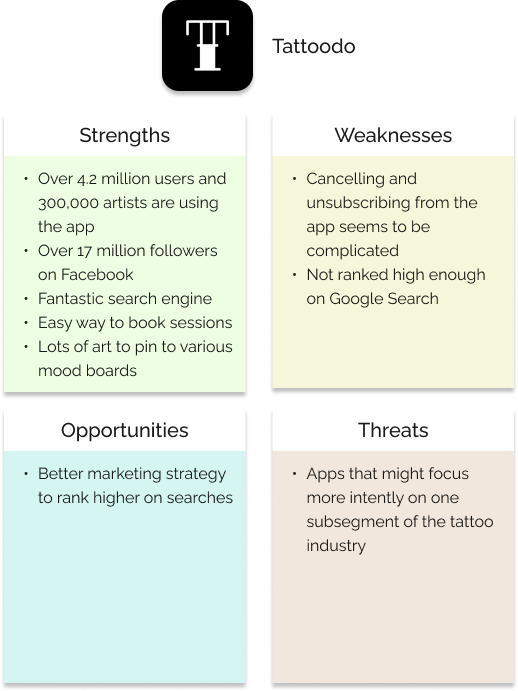
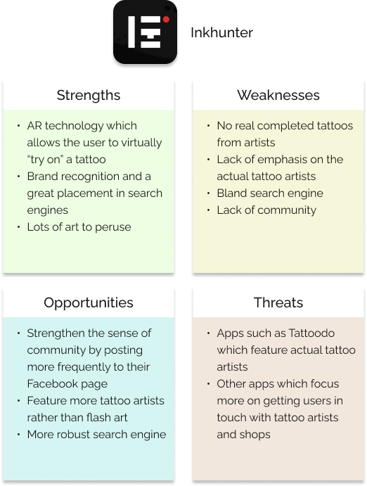
I performed a strength, weakness, opportunity, threat (S.W.O.T.) analysis of two of the larger tattoo apps in the Google Play store as part of a complete competitor profile.
User Research
I conducted some in-depth open-ended interviews of potential users to find insight into their attitudes and behaviors. I also developed a survey I put online to discover which qualities were important to people when choosing a tattoo artist
Key Insights

I found that most people wanted to work with an artist they trusted and found them through word of mouth and recommendations of friends. I also found that tattoo seekers value being able to enjoy the company of the artist above even their tattooing prowess.


User Personas
Armed with valuable data from ink-lovers all over the world, I set about creating user personas that I would use to guide my creation of Tattogether. Because the people who get tattooed are as unique as tattoos themselves, I came up with two different personas, each with their own reasons and considerations for choosing a tattoo artist or parlor. Thus the challenge was for me to create an app which would satisfy each of their needs.
Gene Hammond
Age : 32
Occupation : Truck Driver
Marital Status : Single
Location : Portland, OR
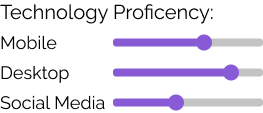
Technology Proficiency :
Goals and Needs
Gene has been saving up for a sleeve tattoo and has a good idea, but he needs some help and guidance from a professional tattoo artist. He recently relocated to Portland from Bend Oregon and needs to find a new tattoo artist. He would like to have his sleeve finished in three weeks.
Motivations
He’s new to the city and would like to meet new people who share his interests. He’s motivated to finish his sleeve in three months because he plans on going to the beach often in the summer and he wants to show off his new ink.
Frustrations
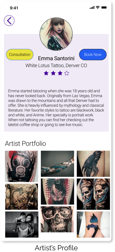
Gene has been tattooed by people in the past who said they were proficient in a certain style, but then turned out not to be. He wants to be able to browse an artist’s finished work to find out wether or not to go with her.
Notable Quotes
“I want to find an artist who gets me. I have lots of big ideas and I want to make sure those are given their due time and consideration.”
Jessica Crowley
Age : 38
Occupation : Interior Decorator
Marital Status : Single
Location : Phoenix, AZ
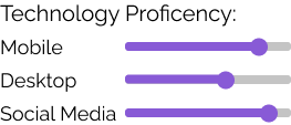
Technology Proficiency :
Goals and Needs
Jessica is a very busy mother and entrepreneur. She stays busy with her interior design business and also taking care of her three year old daughter. Between meeting clients and running errands she needs to find a tattoo artist that will work with her hectic schedule.
Motivations
Jessica is motivated by a need to be at the top of her game. She has been in the interior design business for eight years and has created a substantial clientele list. She has a few tattoos but wants to start a whole series of tattoos that will be related.
Frustrations
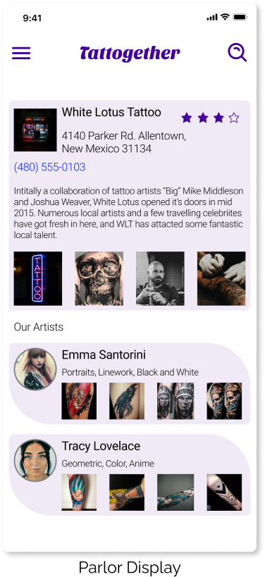
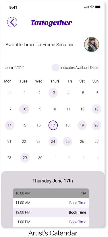
She has been frustrated by other tattoo artists with whom she has made appointments only to have them cancel at the last minute. She wants to be able to read customer comments on tattoo artists and parlors and leave comments of her own.
Notable Quotes
“Turtles are important to me because they remind me to slow down and appreciate the best parts of my life.”
Information Architecture
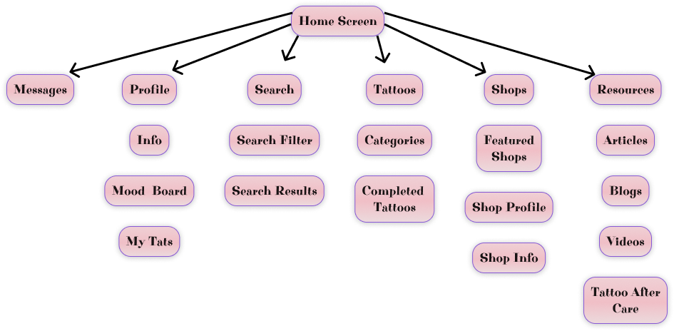
From the landing page, to booking an appointment for an artist, I wanted to ensure that the information architecture was clean and easy to use. Using the card sorting technique I was able to come up with a sitemap that I was happy with and that most people I tested it with liked.

Key Insights
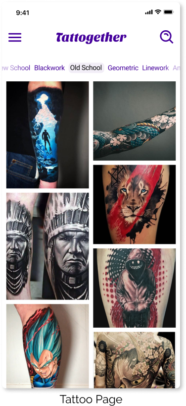
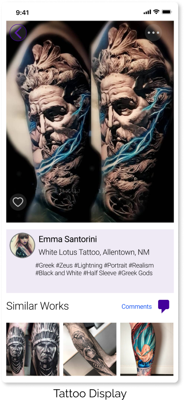
Since the primary focus of Tattogether is bringing artists and enthusiasts together to make a real connection, I knew I had to keep the user interface very simple and let the artwork be the main focus.


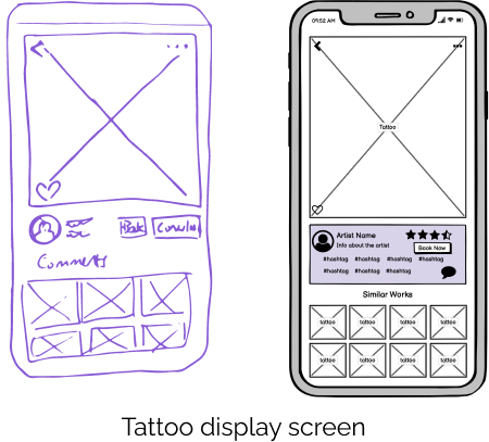
Low & Mid Fidelity Wireframes
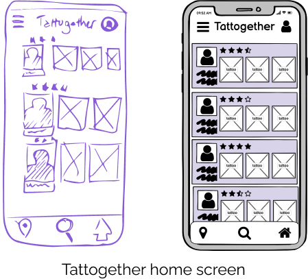
I utilized the crazy 8s method of quickly sketching low fidelity wireframes and then used the dot voting system for choosing which ones I wanted to go with. Mid-Fidelity wireframes were then created in Balsamiq to move closer to an early prototype.
Prototyping and Usability Testing
After developing the mid-fidelity wireframes, it was time to put them together into a clickable prototype and get it into the hands of some real people for initial usability testing. I wrote a test script and included a few different tasks for the testers to complete. It didn’t take long before I could see what I had done right, and what aspects needed further refining.

Key Insights
During user testing I found out that I didn’t need the navigation bar at the bottom of the screen, so I did away with it to simplify the UI. I also found that there were certain tasks a majority of testers had problems completing. I knew I had to tweak my prototype more before diving into final mockups.


High Fidelity Mockups & Deliverables
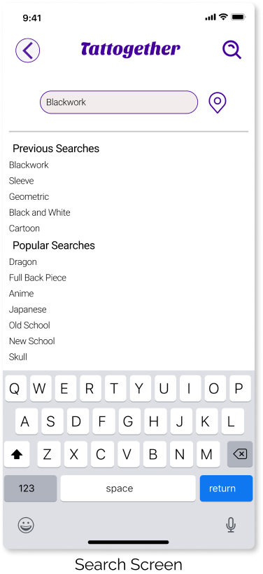
Here are the final high-fidelity mockups for Tattogether. The icons I kept simple and relatable, and the primary color I chose to emulate the color of tattoo stencils on the skin before the artist starts tattooing.

Key Insights
Overall I am very pleased with the artist friendly form and function of Tattogether. I learned a lot about the qualities that people look for when choosing a tattoo artist, and I addressed the problem I initially set out to solve; giving artists and tattoo enthusiasts a way to connect, book time, and showcase their skills from the comfort of their phone.

Thank you
