
Client : Scholastic Project
Tools : Figma, Balsamiq, InVision
Duration : 9 months
Problem Statement
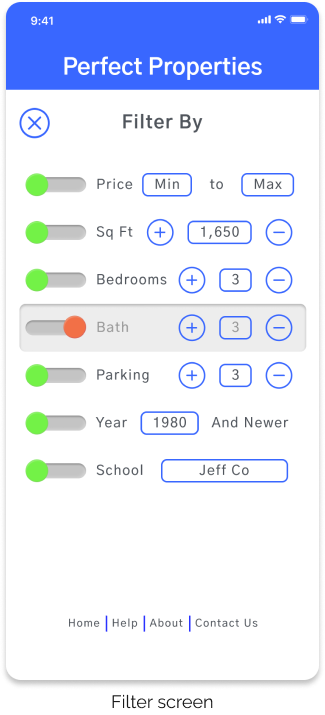
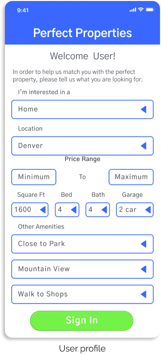
Buying and selling property can be a daunting proposition for a lot of people. Inexperienced buyers need a way to filter properties based on criteria that are important to them an save properties for further consideration.
My Process
For this project I was given the basic UX framework to start with, and was tasked with creating the functionality in an attractive user interface. Istarted with getting inspired and finished with high-fidelity wireframes at multiple breakpoints.


Mood Board
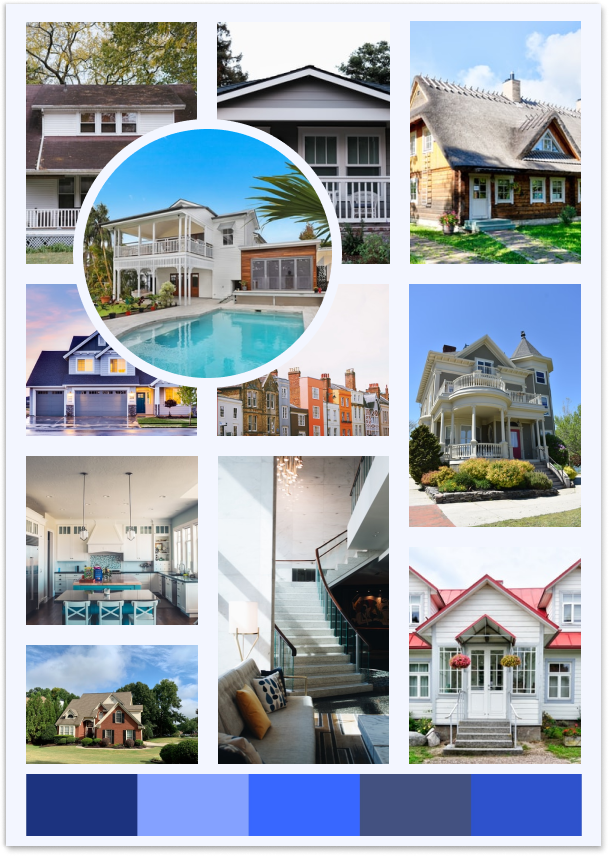
I created a mood board at the start of this project to keep for inspiration and got to sense what kind of property pictures I wanted to include in the final hi-fidelity wireframes. I choose pictures of houses that looked inviting, attainable and real.
Color Palette
For the color palette I chose a blue theme because blue invokes a sense of calm and trustworthiness. Purchasing a new property can be stressful so I made sure to choose colors that would put the user at ease.


User Persona
I crafted a user persona to keep in mind for whom I was developing Perfect Properties. This helpful for me to keep in mind the needs and worries of someone buying property for the first time and what I could do to make this experience enjoyable.
Rashida Wallace

Age : 42
Occupation : IT Consultant
Marital Status : Married
Location : Denver, CO
Technology Proficiency :

Notable Quotes
I want to provide my family with financial security. I’ve been considering buying property for a while, and I’m looking for a tool that can help me find what I’m looking for quickly.
Goal and Needs
Rashida makes a good living and wants to invest in property beyond the city for increased financial security for herself and her family. Her goal is to purchase a new home in the next two months.
Motivations
Rashida is the mother of two little girls 6 and 9. She wants to find a home that is large enough for her, her husband, and her girls, and is in a good school district. Ideally she would like to be within walking distance of some great local shops and eateries.
Frustrations
There is so much information to process on other property buying apps. Rashida would like to able to filer her searches to include the most relevant properties and have the info layed out in a format that is easy to understand.
Designing for Different Breakpoints
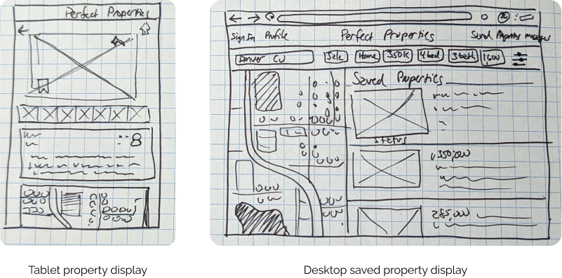
As a part of this project I had to design for multiple breakpoints and decide what information to include at each one. I followed the principles of mobile-first-design to ensure that everything looked great on the smallest possible screen and then scaling up as needed.

Key Insights
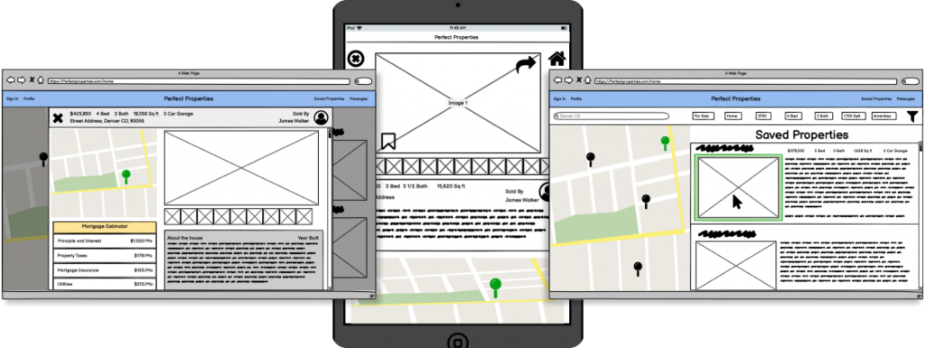
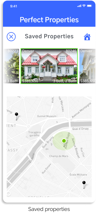
I discovered that including an map area in the saved properties screen would be very helpful in keeping in mind the relative location of each property and the proximity to shopping areas, parks and highways. I also created a desktop wireframe which had a property scroll on the right that corresponds to the larger map on the left.


Mid-Fidelity Wireframes
Working from my low-fidelity sketches, I developed some mid-fidelity wireframes so I could prototype them using InVision and test them on users to see where I may have potential usability issues.
Prototyping & Usability Testing
User testing for the prototype went well. Most people were able to use the filter section to find a property, save a property to their favorites list and then access their saved property list to scroll through their favorite homes.

Key Insights
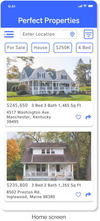
Some people were confused by my initial icon set so I went with a more conventional set for the filter section as well as the share arrow. I also went with the heart icon for saving a property instead of the bookmark. Small changes, but I wanted to make sure I was using common heuristics.


Desktop Hi-Fidelity Wireframes
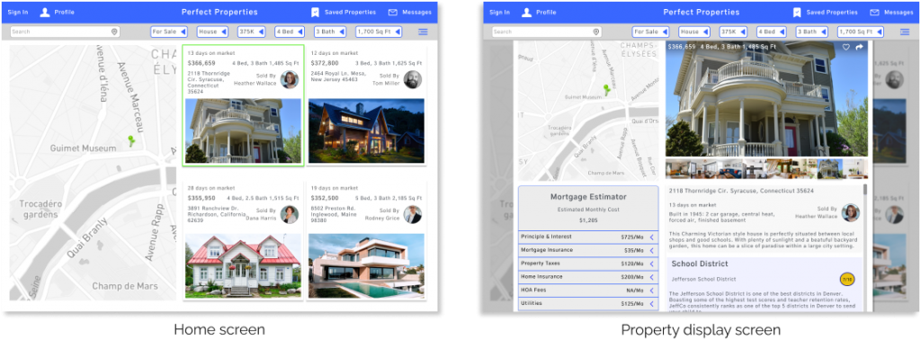
All the frames are fully resizable to fit any screen and still look good. I kept the color scheme minimal and clean to present a professional image. Notice the highlighted property in green corresponds to the green pin on the larger map.
Mobile Hi-Fidelity Wireframes
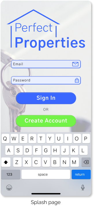
All the frames are fully resizable to fit any screen and still look good. I kept the color scheme minimal and clean to present a professional image.


Key Insights
There was much to learn in order to build a tool to help people buy and sell real estate. I am pleased with the simplicity and functionality of Perfect Properties and I believe I have designed an app that contains that has solved my initial problem statement. The app is easy to use, inviting and great for first time homebuyers.

Thank you
